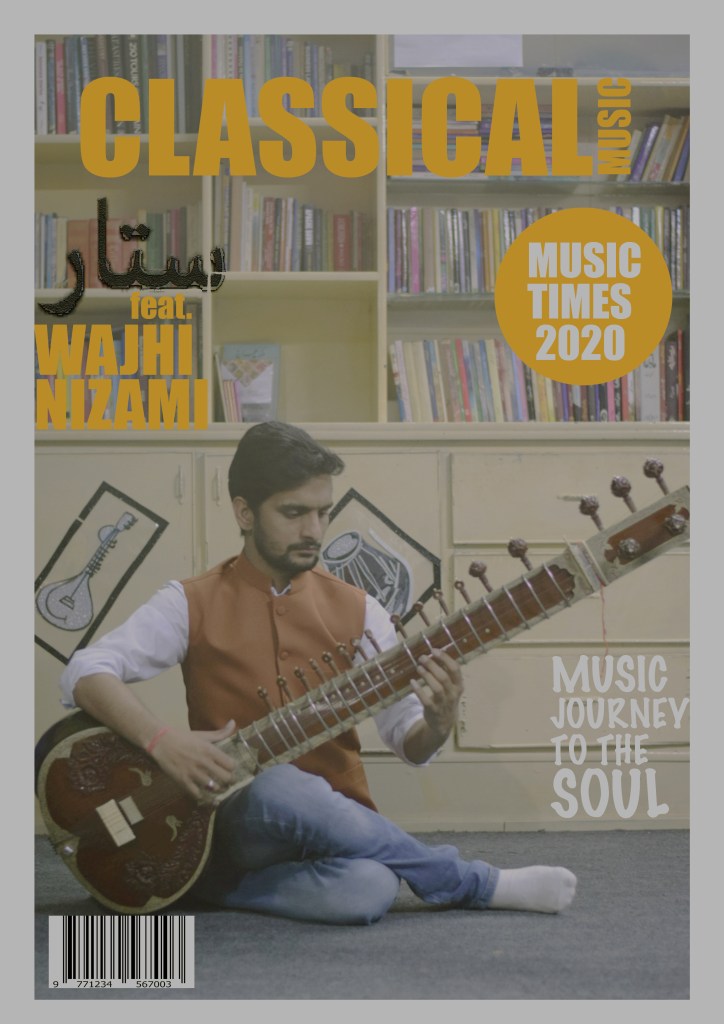
FINAL MAGAZINE COVER
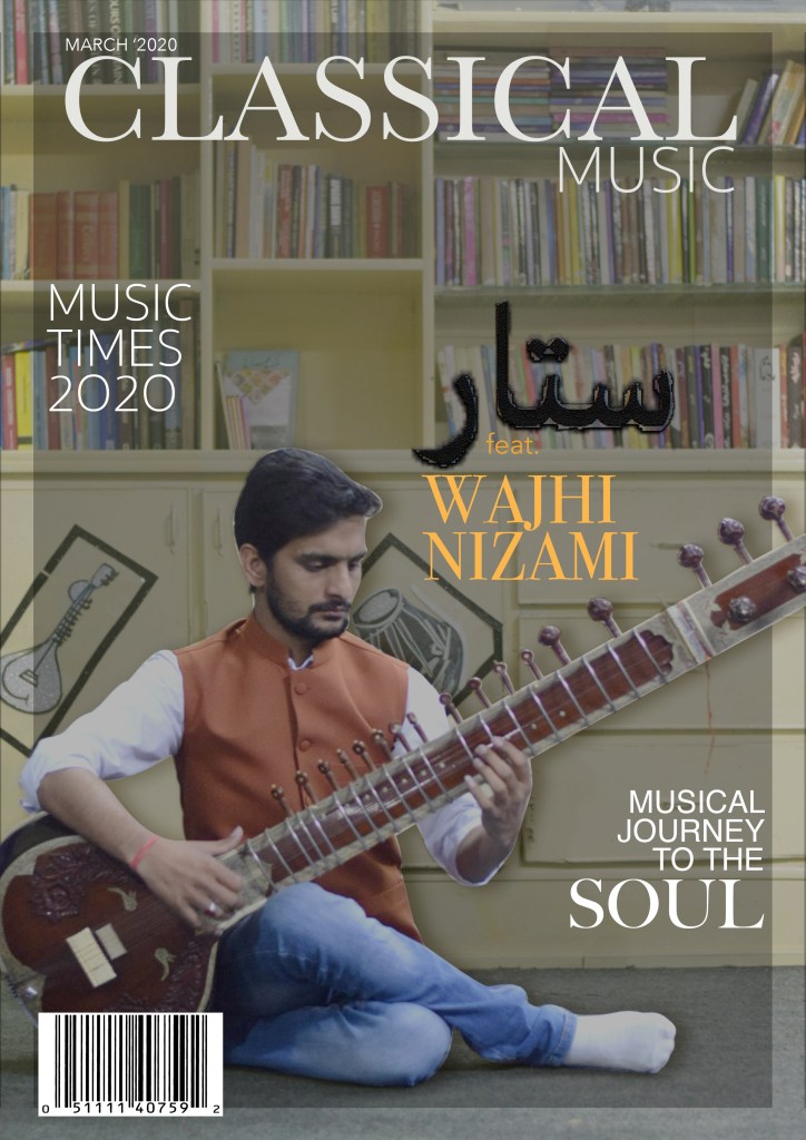
For the magazine cover I wanted to do something elegant and formal. As my magazine was about eastern classical music and fashion both, so it was necessary all of those showed in the cover. For the clothes, I chose a waist coat over a dress shirt with jeans to also keep a casual touch in there. To represent a classical music style I the instrument ‘sitar’ because it is one of the most iconic instrument in this style of music. I conducted in the library to showcase the respectful environment. To go with elegant style I’ve used simplistic text and I wrote sitar in Urdu language to also represent my mother tongue. Because I couldn’t find something that really captured or inspired me, so for the most part of my magazine I gave it an original style.
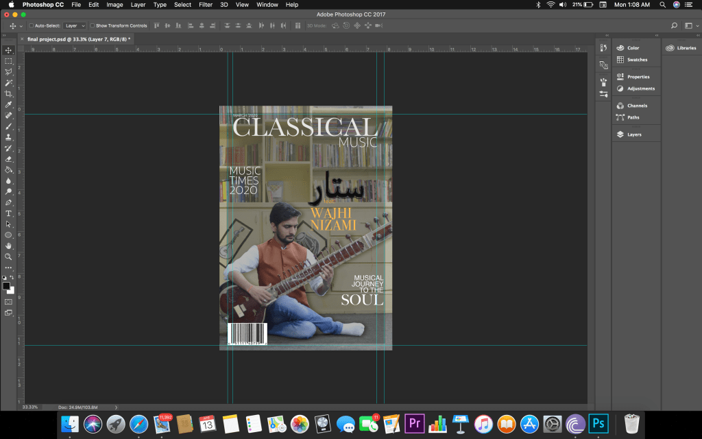
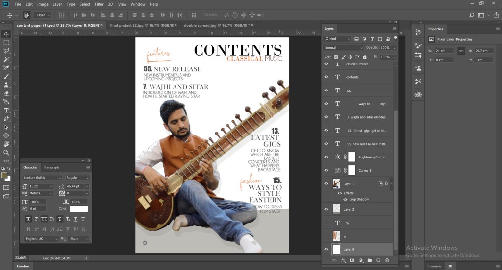
Proof work
This is the proof work for the cover. I took screenshots of almost every step of the cover and you can see how it progressed from the original picture to the magazine cover.
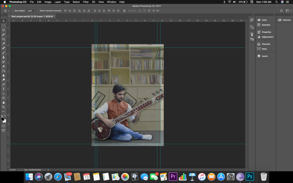
First Attempt
This was my first attempt at making the magazine cover. The picture editing and the title were the easy part. The thing I struggled with was the placement of the text and what exactly should be written because the cover is making the first impression and it needs to be eye catching, so I showcase the model pretty clearly without it look more authentic and just to give it a pop of professionalism. I did not know how much was enough or when I was over doing it.
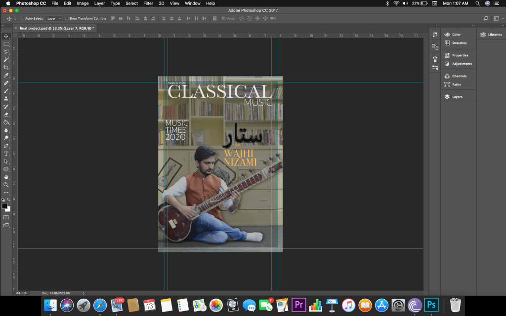
Second Attempt

The main changes I made were colour correction and text replacement to give it a more professional and captivating look. I added the shadow in the model to showcase him properly. I changed the font style of the text to added to the elegant look.
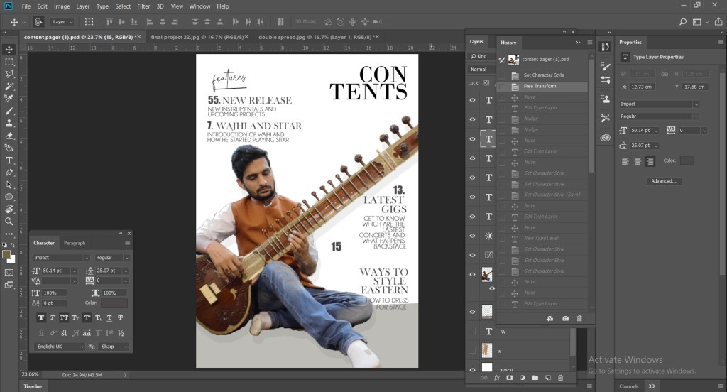
Final content page
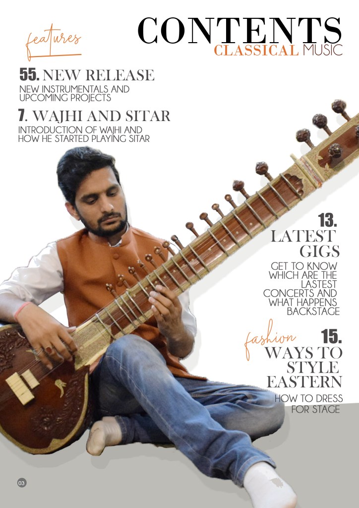
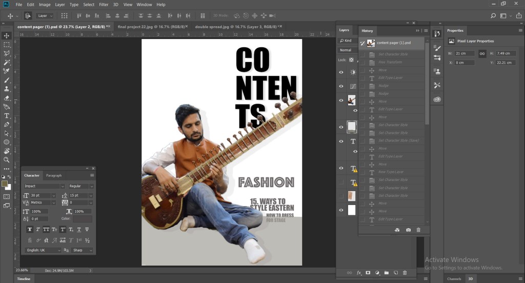
Designing a content page was a challenging part because I didn’t really had a idea about it. I had to make a content page very bold and artistic so it looks appealing to the audience. You can see in my proof work for the content page.
Proof work
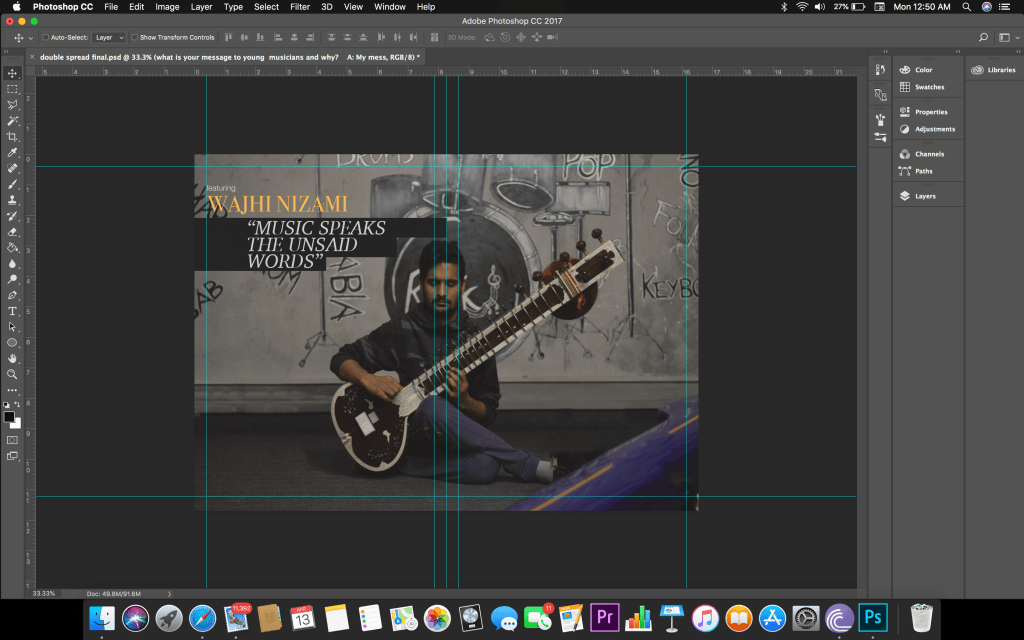
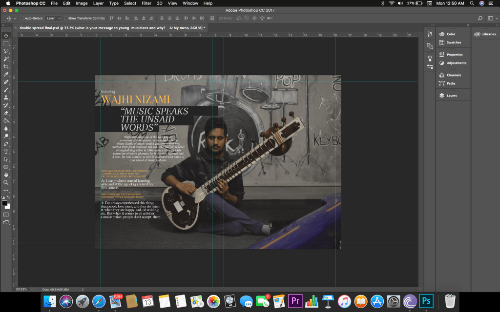
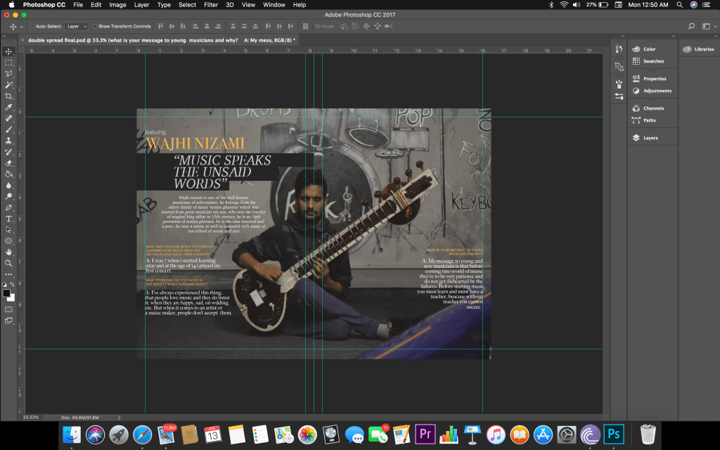
Final double spread
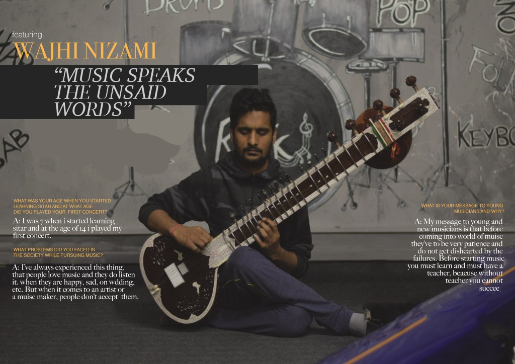
For the double spread I had a clear picture in my mind from the beginning so I didn’t took many different pictures in many styles. I was all because of research and planning I did before developing my project. I wanted my double spread to be darker and artistic. So I wanted to showcase the model as well, so I took centrally alligend picture of the model which would make him stand out. The text I wrote was the interview of the model that I conducted. I chose to keep the text style rather simple to maintain the elegant style I was going for. I also used brighter colours for the text over a darker background to give it a bit vibrant look.
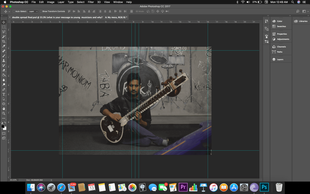
Proof work.
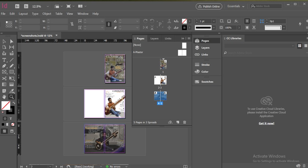
My project on indesign
This is how my project looks on Indesign. It was probably the most important application as it showed me how my magazine would look as a magazine and formatted the cover, contents page and double spread for me as a magazine.